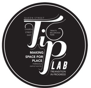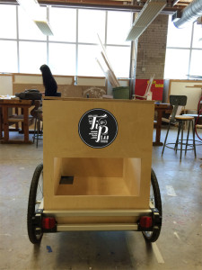
TiP lab – the making of the logo
One of the most difficult tasks: establishing a logo. The concept of the mobile lab suggests that the logo should be dynamic, yet simple. In fact, it should convey the idea of movement and mobility. At the same time, this is a project that aspires to create a different type of cartography. unlike traditional cartography, whose main goal is to provide a top-down, birds-eye view of a specific location, The lab will build its own cartography in vivo, with the people and the local environment with which it interact and which it traverses. How to convey such idea? how can we make it visible and communicable to people who don’t know the project? here are a few attempts
a “modernist” style
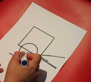
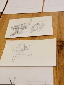
some sketches made by Shahrzad Khosrowshahi. The idea is to create a logo that conveys the idea of a different map, with the neighborhoods emerging in the background.
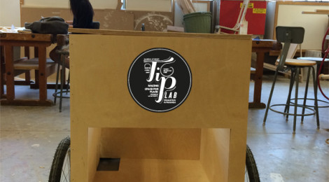
after this first attempt, many other fonts and styles were tried, until we finally found a great logo. we are now making some changes and adding more details, but
